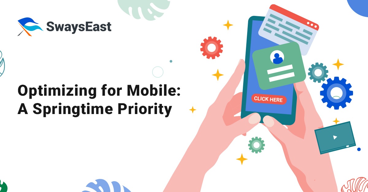
Since the number of mobile phones and their usage has surpassed that of desktop computers, mobile responsive design has gone from being an optional feature to a crucial part of website development. Optimizing for mobile has never been so important.
Plus, it’s obvious that responsive design alone isn’t cutting it anymore. Online stores that want to increase their conversion rate should adapt to the changing digital landscape and focus on mobile optimization.
The term “mobile optimization” refers to the steps you take to tailor your website’s content to the specific needs of users accessing it via mobile devices.
The goal of creating a mobile-optimized site is to make the user experience better on smaller screens, not only to make the information smaller or rearrange it.
Why is it crucial to optimize mobile devices?
Retailers need to learn what makes a smooth shopping experience. This means thinking about both offline contact and how important it is, as well as finding and improving all online touchpoints, with mobile being the most important for turning users into buyers.
People who shop online often use a wide array of gadgets, making them virtual nomads. Because of this, it becomes more difficult to provide users with a “frictionless” experience on all their devices, particularly mobile ones. People will go to a competitor’s site if stores don’t make mobile shopping their main priority.
Obstacles to mobile conversion
Sometimes it’s so annoying to try to use a mobile device to access a website. Bad usability is the result of small buttons, links that are hard to notice, and forms that are not easy to understand. And that doesn’t even account for the limitless scrolling options. Customers will get frustrated and angry if they wait for pages to load slowly or can’t put things in their carts. The end outcome: incomplete checkouts and abandoned carts.
Obviously, no e-commerce site would want this.
But that’s a situation that happens much too often. Just pretend you’re looking for a new pair of wireless headphones online and come upon this store. The search button might not be functional when you try to use it. The next step is to use the menu on the top bar to try to find what you’re looking for.
One last thing: maybe you’ll discover an item that meets most of your requirements. Now you can view the specifications by clicking on each one. To find what you need, you must endlessly pinch, scroll or drag. There’s no comparison option, so you find yourself repeatedly tapping to access the same data.
After you get through all that, you might be required to sign up for an account before you can complete your purchase. The form could be the last straw if it’s hard to fill out or if you must validate your email address, etc.
Customers often give up on making a purchase when they encounter a long list of annoying steps and realize they just don’t have the time or patience to finish them all.
Your conversion rates will be impacted by a mobile-optimized website.
With a current market share of over 55% and a desktop share of 41% (the remaining 1% going to tablets), mobile internet access has increased at an exponential rate in recent years. On the other hand, conversion rates are lower than they are on computers.
Now you know why mobile optimization is so important for e-commerce sites. They should make sure there is no hassle when buying.
A mobile experience that is free of friction includes:
- Giving people bigger buttons
- Reducing the size of images
- Using auto-detect location settings and auto-fill form fields
- Providing a guest checkout option
- Allowing multiple screens instead of scrolling
- Responsive design
The type of site you run will determine the best approach to mobile optimization, although there are several options. Stick to simple, uncluttered layouts whenever possible. However, that becomes more challenging when managing an extensive online store selling a wide variety of products and services. For this reason, fully responsive web design is essential.
Responsive websites automatically adjust to different screen sizes. Images will shrink in size, and a “hamburger” menu will replace the top bar.
You may build a site that is totally mobile-ready with the help of responsive design. Users will find your site more appealing and easier to navigate, which in turn will lead to more conversions. To get the best conversion rates, though, you must optimize even more for mobile.
Customer satisfaction is greatly enhanced with a mobile-friendly website.
Sites restructure themselves entirely for that device with the use of mobile optimization technology, ensuring a better user experience. A mobile-optimized site typically has its own unique URL and is designed with the mobile user in mind; thus it differs visually from a responsive site.
What makes a website mobile-friendly
- Lighter pictures mean faster page loads for mobile-optimized sites, and larger buttons mean easier tapping for users with larger fingers. Their primary function is to make pinching and scrolling easier.
- The language is kept brief and easy to read when optimizing for mobile, and there are minimal processes to convert. Sites that are optimized for search engines typically provide many payment methods, including those that do not require users to enter their credit card information, such as Google Wallet, Apple Pay, or PayPal, to ensure viewers that their details are safe.
- Mobile-friendly websites typically have less graphics and fewer pop-ups. The use of icons and “splash screens” (the initial screen that users view when they launch an app) is done well.
- Due to the restricted real estate on internet screens, it is also suggested to have only one call to action (CTA) on each page.
Conclusion
Your in-depth SEO efforts won’t amount to much if your website isn’t mobile-friendly; this is true even if your marketing plan is top-notch. You can observe measurable improvements in the conversion rate of site visits to buyers by adopting a “mobile-first” mindset. Consistently test modifications as you build your mobile-optimized site. In this way, you can monitor your site’s performance, identify areas for improvement, and ultimately meet your consumers’ needs while maintaining a high conversion rate.
SwaysEast offers a suite of smart digital marketing tools to help brands create innovative solutions and experience their very own AI digital marketing success stories. Book for a FREE APPOINTMENT today.